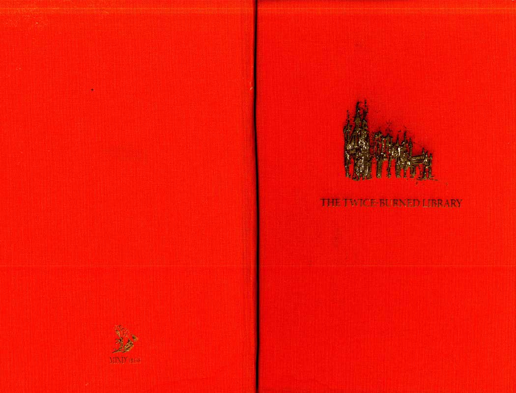
Redesign of the book The Twice-Burned Library, paying attention to The typography, layout, readability and visual appeal. The book cover is accentuated by a unique soft cover of fluorescent orange linen. The striking color symbolizes the burning theme and makes the book stand out on any bookshelf. On the cover is an illustration that I personally drew. The title is subtly and stylishly engraved in the linen. I have also designed an illustration of a toxic frog, which serves as the distinctive logo for the fictional publishing house, named MINDpres. This unique touch gives the book a recognizable element. Along with having bound the book by hand, it is a beautifully finished product.